
On August 6th, 1991, there was one website. Today, there are almost 2 billion. If the digital space is so crowded, how are you supposed to stand out? That’s what we’re going to be discussing in this article. So what makes a good website? To put it simply, a good website excels in both form and function. It has a clear purpose, is aesthetically pleasing, and is easy to navigate. It performs well for a wide range of visitors and is technically sound.
Step 1: Visual Performance
The appearance of your site affects everything from conversion rate to time on page, trustworthiness and organic backlinks. Consider that good site design equates more consumer trust, which in turn equates better conversion rate. Pretty site = more sales.
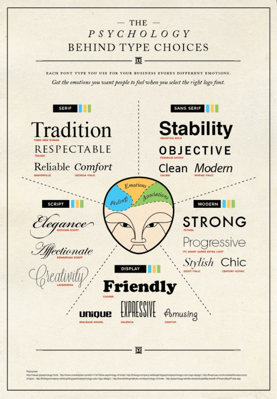
So how do you make an attractive site design? Start with your brand. Your brand is your business’s image. It’s your consumer’s perception of who you are. If you’re starting out in a competitive industry, you’ll be competing against established brands with established customers. You have to be different- with a solid brand building process of your own. You conceive of your brand by asking yourself, what do you want people to think of when they see your site? Your choices, from color to font type, affect the reaction consumers will have when they interact with your site. Take the example of fonts, as displayed in this infographic:
Once you’ve made your design choices, whatever they are, stick to them. Consistency is key. People need to identify your brand and recognize it no matter the platform. Use high-quality images and succinct copy to illustrate your brand and products, bearing in mind that everything that goes on your site should have a purpose.
Step 2: Functional Website Design
Technical web design includes things like responsive design and mobile-friendliness, load speed consideration, search engine optimization (SEO), SSL encryption as well as site architecture and navigation. Responsive web design is the approach that suggests that design and development should respond to the user’s behavior and environment based on screen size, platform, and orientation. It is one that plays well on all screens and devices. It’s mobile-friendly and caters to the device you’re viewing it on.
Smartphones now account for over 51% of all online traffic, and that number is growing. Google takes mobile compatibility into consideration and they now place a priority on ranking mobile-friendly sites. Finally, mobile-friendly makes for a better user experience. And ultimately, it’s all about the user. Considering your market, you may find that your mobile site is more important than the desktop version. For a cool example of a mobile site, check out smokersagainstplastic.org
The next thing to consider is page load time. Gone are the days when people will wait 5 minutes for a page to load (ah, 90’s nostalgia). According to recent surveys, half of web users expect a site to load in 2 seconds or less, and will abandon a site that takes more than 3 seconds to load.
Google offers a free service to test the page load time of your website. This will give you an idea of what’s hurting your load speeds, with suggestions to improve, whether it be steps like browser caching and making above-the-fold content load first (the content you see without scrolling down the page), or optimizing and compressing your images
Step 3: Consider SEO
SEO means optimizing your site to show up in search engines like Google. It follows the basic principle that (almost) no one will visit your site if they can’t find it on a search engine. In order to optimize your search engine results, you need to know who you’re targeting and perform keyword research (know what your consumers are googling). You then need to optimize your site pages with on-page SEO targeting those keywords. Finally, you need to create a strong sitemap for Google and Bing to index your site.
Step 4: Site Architecture & Navigation
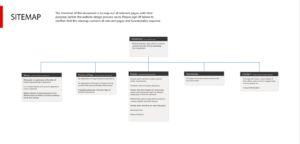
Navigation is important for two main reasons. It leads to better SEO (because it makes it easier for Google to index your site) resulting in better usability (because it’s easier for visitors to find their way around). To help you with this, consider mapping out your website. Creating a physical map helps you see where you’re missing out on linking pages together, and keeps things organized.
Your site map should look something like this:
You should also keep your most important calls-to-action at the top of the page. This is going to see more traffic than the bottom of the page, so it’s a great place for a “shop now” button, a “contact us” tab, or a “learn more” button.
Wrapping Up
Your website is your business card. It’s the thing everyone sees when they think of doing business with you. By keeping your website looking sharp, you ensure everyone who visits it views you as trustworthy, professional, and worthy of doing business with. A strong website pulls in traffic through Google, gets links from authoritative sites, and is shared more often. We’re in 2021. A great website is no longer a “nice to have”. It’s an absolute must.
Do you want to redesign or launch your site? Get in contact with one of our consultants to help you.
